Evaluation visualization
This guide documents all plot functions available for visualizing GRADIEND training and evaluation. It focuses on plot customization only — for how to run evaluation (encoder, decoder, metrics), see Tutorial: Evaluation (intra-model) and Tutorial: Evaluation (inter-model).
Where do these links go?
Function and class names link to the auto-generated API reference (docstrings, signatures, parameters). With show_source enabled, each API page also includes a collapsible source code block — not a GitHub URL. For runnable examples, use the :material-file-code-outline: script links below. Full plot API index: Visualization.
Non-convergence markers
When a run did not meet the convergence threshold, plot titles and multi-model tick/circle labels can show a † suffix (e.g. gender_en †). Control this with:
TrainingArguments.highlight_non_convergence (defaultTrue) — global default for trainer plots.highlight_non_convergenceon each plot function — override per call (Noneon single-model plots inherits from training args).
Set highlight_non_convergence=False to hide markers. Format: NAME † (space before the marker).
Plot overview
See Oriented cross-encoding matrix for the multilingual demo pipeline and a BERT race+gender aggregation walkthrough.
For LaTeX fonts, transition arrows (M -> F), and environment variables, see Plot styling & LaTeX.
1. Training convergence plot
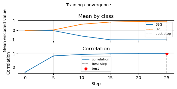
Shows how training metrics evolve over steps: mean encoded value per class/feature class and correlation. The best checkpoint step (by convergence metric) is marked with a vertical line.
Entry points
# Via trainer (typical)
trainer.plot_training_convergence()

# Standalone (from model dir or pre-loaded stats)
from gradiend.visualizer.convergence import plot_training_convergence

plot_training_convergence(model_path="runs/experiment/model", show=True)
plot_training_convergence(training_stats=stats_dict, output="convergence.pdf")
:material-file-code-outline: start_workflow.py
Customization options
| Parameter | Type | Default | Description |
|---|---|---|---|
label_name_mapping |
Dict[str, str] |
None |
Map class/feature-class ids to display labels (e.g. "masc_nom" → "Masc. Nom."). Use when raw ids are technical or hard to read. |
plot_mean_by_class |
bool |
True |
Include subplot for mean encoded value per class. |
plot_mean_by_feature_class |
bool \| None |
None (auto) |
Include subplot for mean encoded value per feature class. When None, defaults to False if redundant with mean-by-class (e.g. all_classes == target_classes or no identity transitions), otherwise True. |
plot_correlation |
bool |
True |
Include subplot for correlation over steps. |
class_spread |
"minmax" | "iqr" | "ci95" | None |
None |
Shade spread behind each class mean line. "minmax" shades min-max encoded values; "iqr" shades the interquartile range (Q1-Q3); "ci95" shades a 95% confidence interval around the mean (mean ± 1.96 * std / sqrt(n)). Requires spread stats from newer training runs. |
best_step |
bool |
True |
Draw vertical line and mark best checkpoint step. |
title |
str or bool |
True |
True = use run_id, False = no title, string = custom title. |
highlight_non_convergence |
bool or None |
None |
When True, append † to the title if the run did not converge. None uses TrainingArguments.highlight_non_convergence (default True). |
figsize |
Tuple[float, float] |
None |
Figure size in inches. Default: (8, 3 * n_subplots). |
output |
str |
None |
Explicit output file path. |
experiment_dir |
str |
None |
Used to resolve default artifact path when output is not set. |
show |
bool |
True |
Whether to call plt.show(). |
img_format |
str |
"png" |
Image format (e.g. "pdf", "png"). Appended to output path. |
return_fig_ax |
bool |
False |
Return the live Matplotlib (fig, axes) and leave it open for final custom edits. |
Use cases
- Human-readable class labels (e.g. German article paradigm): pass
label_name_mappingso legend shows "Masc. Nom." instead ofmasc_nom. See train_gender_de_detailed.py. - Many classes (e.g. identity transitions): with ≥6 series a single figure-level legend is drawn to the right of the plot (independent of subplot height). Use
legend_ncol,legend_bbox_to_anchor, andlegend_locto adjust placement. - Mean uncertainty bands: use
trainer.plot_training_convergence(class_spread="ci95")to shade the 95% confidence interval around each class mean. Use"iqr"for distribution spread and"minmax"for the full observed range. - Publication-ready figure: set
output,figsize, andimg_format="png"or"pdf". - Minimal plot (only correlation): set
plot_mean_by_class=False,plot_mean_by_feature_class=False. - Final Matplotlib tweaks: call with
show=False, return_fig_ax=True, then edit the returned axes beforefig.savefig(...)orplt.show().
2. Encoder distribution plot
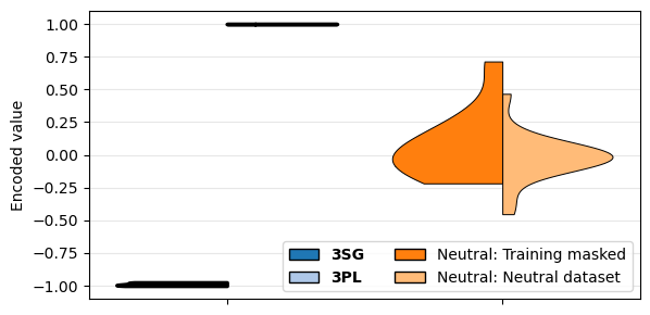
Grouped split violins showing the distribution of encoded values by transition/class. By default the plot shows only the target (training) transition(s) and neutral data; use target_and_neutral_only=False to include all transitions. Each group has left and right halves (e.g. masc→fem vs fem→masc in one split violin). When using trainer.evaluate_encoder() with plot=True, any plot option can be forwarded via plot_kwargs (e.g. plot_kwargs=dict(target_and_neutral_only=False, show=False)).
Entry points
# Via trainer (requires encoder_df from evaluate_encoder; plot options via plot_kwargs)
enc_eval = trainer.evaluate_encoder(max_size=100, return_df=True, plot=True, plot_kwargs={...})

# Direct call with pre-computed encoder_df
trainer.plot_encoder_distributions(encoder_df=enc_df, legend_name_mapping={...})
Customization options (via plot_kwargs or direct call)
| Parameter | Type | Default | Description |
|---|---|---|---|
target_and_neutral_only |
bool |
True |
Restrict the plot to the target (training) transition(s) and neutral data only. Set to False to show all transitions. Uses trainer.pair to determine the target transition(s). |
class_label_mapping |
Dict[str, str] |
None |
Map individual class ids before transition labels are built (e.g. "masc_nom" → "Masc. Nom.", yielding "Masc. Nom. -> Fem. Nom."). |
legend_name_mapping |
Dict[str, str] |
None |
Map full legend labels to display names (e.g. "masc_nom -> fem_nom" → "M→F"). |
legend_group_mapping |
Dict[str, List[str]] |
None |
Group multiple transitions into one legend entry. Keys = display label; values = list of labels to merge after class_label_mapping has been applied. Groups are downsampled to balance counts. Example: {"der": ["masc_nom -> masc_nom", "fem_dat -> fem_dat"], "die": ["fem_nom -> fem_nom", "fem_acc -> fem_acc"]}. |
paired_legend_labels |
List[str] |
None |
Explicit order of legend labels. Consecutive pairs (0,1), (2,3), … form split violins. |
violin_order |
List[str] |
None |
Order of violin groups on the x-axis (by legend label name). |
colors |
Dict[str, str] |
None |
Map legend labels to hex colors. |
cmap |
str |
"tab20" |
Matplotlib colormap for palette. |
legend_loc |
str |
"best" |
Matplotlib legend location. When >6 entries and legend_bbox_to_anchor is not set, legend is placed below the plot. |
legend_ncol |
int |
2 |
Number of columns in the legend. |
legend_bbox_to_anchor |
Tuple[float, float] or None |
None |
(x, y) for legend. When >6 entries and None, legend is placed below (0.5, -0.06). |
title |
str or bool |
True |
True = use run_id, False = no title, string = custom title. |
highlight_non_convergence |
bool or None |
None |
Append † to title when the run did not converge. None uses TrainingArguments.highlight_non_convergence. |
return_fig_ax |
bool |
False |
Return the live Matplotlib (fig, axes) and leave it open for final custom edits. |
title_fontsize |
float |
None |
Title font size. |
label_fontsize |
float |
None |
Axis tick label font size. |
axis_label_fontsize |
float |
None |
Axis label font size. |
legend_fontsize |
float |
None |
Legend text font size. |
output |
str |
None |
Explicit output path. |
output_dir |
str |
None |
Output directory when output and experiment_dir are not set. |
show |
bool |
True |
Whether to call plt.show(). |
img_format |
str |
"png" |
Image format (e.g. "pdf", "png"). |
Use cases
- Show all transitions (e.g. multi-class pronoun setup): pass
target_and_neutral_only=Falseso the plot includes every transition, not only the target pair and neutral. - Renaming labels for readability: use
class_label_mapping={"masc_nom": "Masc. Nom.", "fem_nom": "Fem. Nom."}to rename classes before transition labels are built, orlegend_name_mapping={"masc_nom -> fem_nom": "M→F"}to rename full legend labels. See train_gender_de_detailed.py. - Grouping by surface form (e.g. all “der” transitions together):
legend_group_mapping={"der": ["masc_nom -> masc_nom", "fem_dat -> fem_dat", ...], "die": [...], "das": [...]}. See train_gender_de_detailed.py. - Many legend entries (>6): the legend is placed below the plot by default so the axes stay large. Override with
legend_bbox_to_anchor=(x, y)andlegend_locif needed. - Custom colors for specific classes:
colors={"M→F": "#1f77b4", "F→M": "#ff7f0e"}. - Paper-style plot: set
legend_fontsize,axis_label_fontsize,output,img_format="png". - Final Matplotlib tweaks: call with
show=False, return_fig_ax=True, then edit the returned axes beforefig.savefig(...)orplt.show().
3. Encoder scatter plot
Interactive Plotly scatter: x = target/category, y = encoded value, colored by a chosen column. Intended for Jupyter to inspect outliers (hover shows point data).
Optional dependency: Plotly is required for this plot. Install with pip install gradiend[plot] or pip install gradiend[recommended]. If Plotly is not installed, the function returns None and logs a warning. See Installation.
Example: Jupyter notebook gradiend/examples/plot_encoder_scatter.ipynb — shows a general interactive encoder scatter and a sentiment by-target interactive strip plot for outlier inspection.
Entry point
Customization options
| Parameter | Type | Default | Description |
|---|---|---|---|
encoder_df |
pd.DataFrame |
None |
Pre-computed encoder analysis. If None, calls trainer.analyze_encoder(). |
color_by |
str |
"label" |
Column used for point color. |
hover_cols |
List[str] |
None |
Columns shown on hover. Default includes text/masked context, target token, label, feature class, split, and type when present. |
x_col |
str |
None |
Column for the categorical x-axis. Default prefers target/factual token, then feature class/source/type. |
label_name_mapping |
dict |
None |
Optional mapping from raw color labels to display names. |
max_points |
int |
None |
Max number of points; subsampling is stratified. |
stratify_by |
str |
None |
Column for stratified subsampling when max_points is set. Default: feature_class or color_by. |
cmap |
str |
"tab20" |
Matplotlib colormap for colors (matches encoder violins). |
height |
int |
500 |
Figure height in pixels. |
title |
str |
None |
Plot title. |
highlight_non_convergence |
bool or None |
None |
Append † to title when the run did not converge. |
output_path |
str |
None |
Path to save HTML. |
output_dir |
str |
None |
Directory for HTML when output_path and experiment_dir are not set. |
show |
bool |
True |
Whether to display the figure. |
hover_text_max_chars |
int |
180 |
Max characters for text/masked context in hover; truncated around first [MASK] with ... when present. |
hover_text_line_chars |
int |
90 |
Soft line length for hover text wrapping. |
Use case
- Outlier inspection in Jupyter: run with default
show=True; hover over points to seetext,label, etc. - Large datasets: set
max_points=500to avoid slow rendering; usestratify_by="feature_class"to keep class balance.
4. Top-k overlap heatmap
Heatmap of pairwise overlap between top-k weight index sets across multiple GRADIEND models. Rows and columns are the dict keys of models; use display labels (e.g. run_id or "3SG ↔ 3PL") as keys for readable axis labels. Cell value is overlap (raw count or normalized fraction).
Entry point
from gradiend.visualizer.topk.pairwise_heatmap import plot_topk_overlap_heatmap

models = {t.run_id: t.get_model() for t in trainers}
plot_topk_overlap_heatmap(
    models,
    topk=1000,
    part="decoder-weight",
    output_path="topk_overlap_heatmap.png",
)
Parameters
| Parameter | Type | Default | Description |
|---|---|---|---|
models |
Dict[str, ModelWithGradiend] |
required | Mapping from label to model. Keys are used as axis labels; use display labels (e.g. run_id or "3SG ↔ 3PL") as keys. |
highlight_non_convergence |
bool |
True |
Append † to axis labels for models that did not converge. |
topk |
int \| float |
1000 |
Number of top weights per model, or a fraction in (0, 1] such as 0.01 for the top 1% per model. |
part |
str |
"decoder-weight" |
Weight part for importance ranking: encoder-weight, decoder-weight, decoder-bias, or decoder-sum. |
value |
str |
"intersection" |
Cell value: "intersection" (raw |A ∩ B|) or "intersection_frac" (normalized overlap). When selected set sizes differ, "intersection_frac" is |A ∩ B| / min(|A|, |B|), i.e. the fraction of the smaller selected set contained in the intersection. |
order |
str or List[str] |
"input" |
Order of models on axes: "input" (dict order), "name" (alphabetical), or explicit list. Ignored if pretty_groups is set. |
cluster |
bool |
False |
Reorder models by similarity (greedy) so similar models are adjacent. |
annot |
bool or str |
"auto" |
True = always annotate cells, False = never, "auto" = annotate only if ≤ 25 models. |
fmt |
str |
None |
Format string for annotations (e.g. "d", ".2f"). Default: "d" for intersection, ".2f" for fraction. |
figsize |
Tuple[float, float] |
None |
Figure size. Default: (max(14, n*0.4), max(14, n*0.4)). |
cmap |
str |
"viridis" |
Colormap for heatmap. |
vmin, vmax |
float |
None |
Colormap bounds. Default: [0, k] for intersection, [0, 1] for fraction. |
scale |
str |
"linear" |
Color scale: "linear", "log", "sqrt", or "power". |
scale_gamma |
float |
None |
Gamma for scale="power" (e.g. 0.5 for sqrt-like). |
pretty_groups |
Dict[str, List[str]] |
None |
Map group name → list of labels (dict keys). Groups are shown on top/right; keys must be disjoint. Uncovered keys go to "Other". |
annot_fontsize |
float |
None |
Font size for cell annotations. |
tick_label_fontsize |
float |
None |
Font size for axis tick labels. |
group_label_fontsize |
float |
None |
Font size for group labels (when pretty_groups is set). |
cbar_pad |
float |
None |
Padding between heatmap and colorbar. |
title |
str or bool |
False |
Plot title. Default title is auto-generated. |
output_path |
str |
None |
Path to save the figure. |
show |
bool |
True |
Whether to call plt.show(). |
return_data |
bool |
True |
Return overlap matrix and auxiliary data. |
return_fig_ax |
bool |
False |
Also return the live Matplotlib figure and axis. With return_data=True, the return value is (data, fig, ax); otherwise (fig, ax). |
ax |
Matplotlib axis | None |
Draw into an existing axis instead of creating a new figure. |
Use cases
- Compare many runs (e.g. German article paradigm): pass a
modelsdict whose keys are the display labels (e.g. "der ↔ die", "3SG ↔ 3PL") and usepretty_groupsto group by transition. See train_gender_de_detailed.py and Cross-model comparison. - Normalized comparison across experiments:
value="intersection_frac". - Percentage-based top-k selection: pass
topk=0.01to compare the top 1% of weights per model. - Clustered layout:
cluster=Trueto order models by similarity. - Publication: set
output_path,figsize,tick_label_fontsize,annot_fontsize. - Custom layout: pass
ax=my_axto compose the heatmap in your own subplot layout, or usereturn_fig_ax=Trueto modify labels, legends, or layout before saving.
5. Top-k overlap Venn diagram
Venn diagram showing the intersection of top-k weight sets across 2–6 models. Dict keys of models are used as set labels; use the same display labels as keys as for the heatmap for consistent labeling. For 2–3 models uses matplotlib-venn; for 4–6 uses the venn package.
Entry point
from gradiend.visualizer.topk import plot_topk_overlap_venn

plot_topk_overlap_venn(
    models,
    topk=1000,
    part="decoder-weight",
    output_path="topk_overlap_venn.png",
)
Parameters
| Parameter | Type | Default | Description |
|---|---|---|---|
models |
Dict[str, ModelWithGradiend] |
required | Mapping from label to model (2–6 entries). Keys are used as set labels; use display labels as keys for consistency with the heatmap. |
highlight_non_convergence |
bool |
True |
Append † to circle labels for models that did not converge. |
topk |
int |
1000 |
Number of top weights per model. |
part |
str |
"decoder-weight" |
Weight part: encoder-weight, decoder-weight, decoder-bias, or decoder-sum. |
output_path |
str |
None |
Path to save the figure. |
show |
bool |
True |
Whether to call plt.show(). |
Return value
Dict with per_model (label → list of weight indices; keys match input models), intersection, union, topk, part. Useful for downstream analysis.
Dependencies
- 2–3 models:
pip install matplotlib-venn - 4–6 models:
pip install venn
6. Encoder by-target plot
Shows encoded values per masked target token (x-axis), grouped by feature class, colored by split (train / val / test). Use this to verify vocabulary-held-out splits and inspect per-word stability.
Entry point
enc = trainer.evaluate_encoder(split="test", return_df=True)
trainer.plot_encoder_by_target(
    encoder_df=enc["encoder_df"],
    plot_style="strip",       # strip | box | violin
    hue_col="data_split",
    interactive=False,        # True -> Plotly HTML (requires gradiend[plot])
)
Multi-seed aggregate:
Key parameters
| Parameter | Default | Description |
|---|---|---|
target_col |
"source_token" |
X-axis: masked target token |
class_col |
"source_id" |
Facet / group by feature class |
hue_col |
"data_split" |
Color by split — use for holdout verification |
plot_style |
"strip" |
strip, box, or violin |
interactive |
False |
Plotly strip with hover (Jupyter-friendly) |
Use cases
- Vocabulary holdout: test targets should appear only in the test hue — see Data splits.
- Outliers: set
interactive=Trueand hover for masked context. - Publication:
plot_style="box", setoutput,legend_loc.
Example: train_sentiment.py
7. Suite comparison heatmaps
After training a trainer suite:
suite.plot_similarity_heatmap(measure="cosine", output_path="suite_similarity.png")
suite.plot_cross_encoding_heatmap(output_path="suite_cross_encoding.png")
suite.plot_topk_overlap_heatmap(topk=1000, output_path="suite_topk_overlap.png")
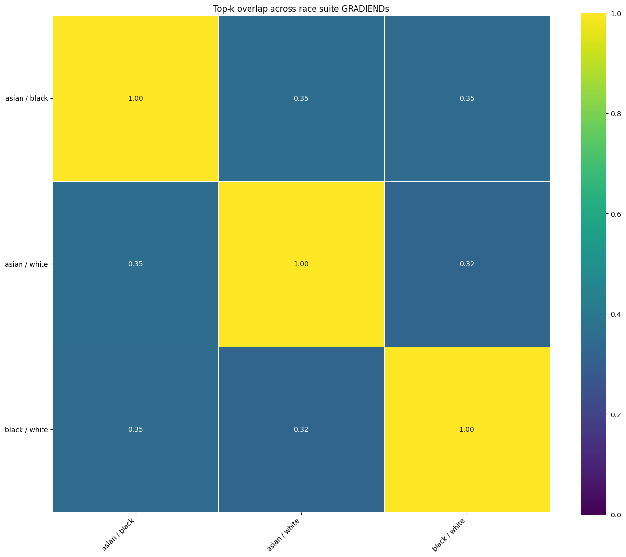
SymmetricTrainerSuite.plot_cross_encoding_heatmap(feature_classes, ...).
8. Cross-encoding matrices (dense)
For multi-class suites with a shared test pool:
plot_gradiend_transition_cross_encoding_heatmap(...)
plot_cross_encoding_heatmap(trainers, feature_classes, alignment="counterfactual")
See Oriented cross-encoding matrix for semantics and a worked cell trace.
9. Seed comparison heatmaps
from gradiend import plot_comparison_heatmap, compute_similarity_matrix

comparison_data = compute_similarity_matrix(models_by_seed, measure="topk_overlap", topk=1000)
plot_comparison_heatmap(comparison_data, output_path="seed_comparison_topk_overlap.png")
Full workflow: train_multi_seed_stability.py
Image format and output paths
Plots that save to disk use img_format (e.g. "pdf", "png") when available. If experiment_dir is set via TrainingArguments, the trainer resolves default paths under that directory (e.g. [experiment_dir]/[run_id]/training_convergence.png). You can override with explicit output, output_path, or output_dir parameters.
Example references
| Script / notebook | Plots demonstrated |
|---|---|
| train_gender_de_detailed.py | Training convergence with label_name_mapping; encoder distributions with legend_group_mapping; top-k heatmap with value="intersection_frac"; top-k Venn per transition. |
| train_english_pronouns.ipynb | Full workflow: data creation → training (3SG vs 3PL) → encoder/decoder evaluation and probability-shifts plot. |
| train_gender_de.py | Basic training convergence, encoder distributions, decoder evaluation. |
| train_sentiment.py | Vocabulary-held-out splits; by-target, facet, and multi-seed plots. |
| train_sentiment_positive_suite.py | Suite similarity and cross-encoding heatmaps. |
| multilingual_gradiend_demo_small.py | Symmetric suite; dense and anchor-aligned cross-encoding heatmaps. |
| train_multi_seed_stability.py | Layer-wise and pairwise seed comparison heatmaps. |
| evaluation-inter-model | Top-k overlap concepts, heatmap and Venn usage. |